Pre-Requisites
Adding Interactivity to HTML With JavaScript
Assignment Summary
So far, you have created an application that allows the user to input a note and displays all past notes. There has been very little focus on the design of the user interface. In this assignment, you will use CSS to make the application more visually appealing and functional.
In this assignment you will:
- Learn what Cascading Style Sheets are
- Add a header
- Load an Image
- Style the text input
- Style the submit button
- Style the notes
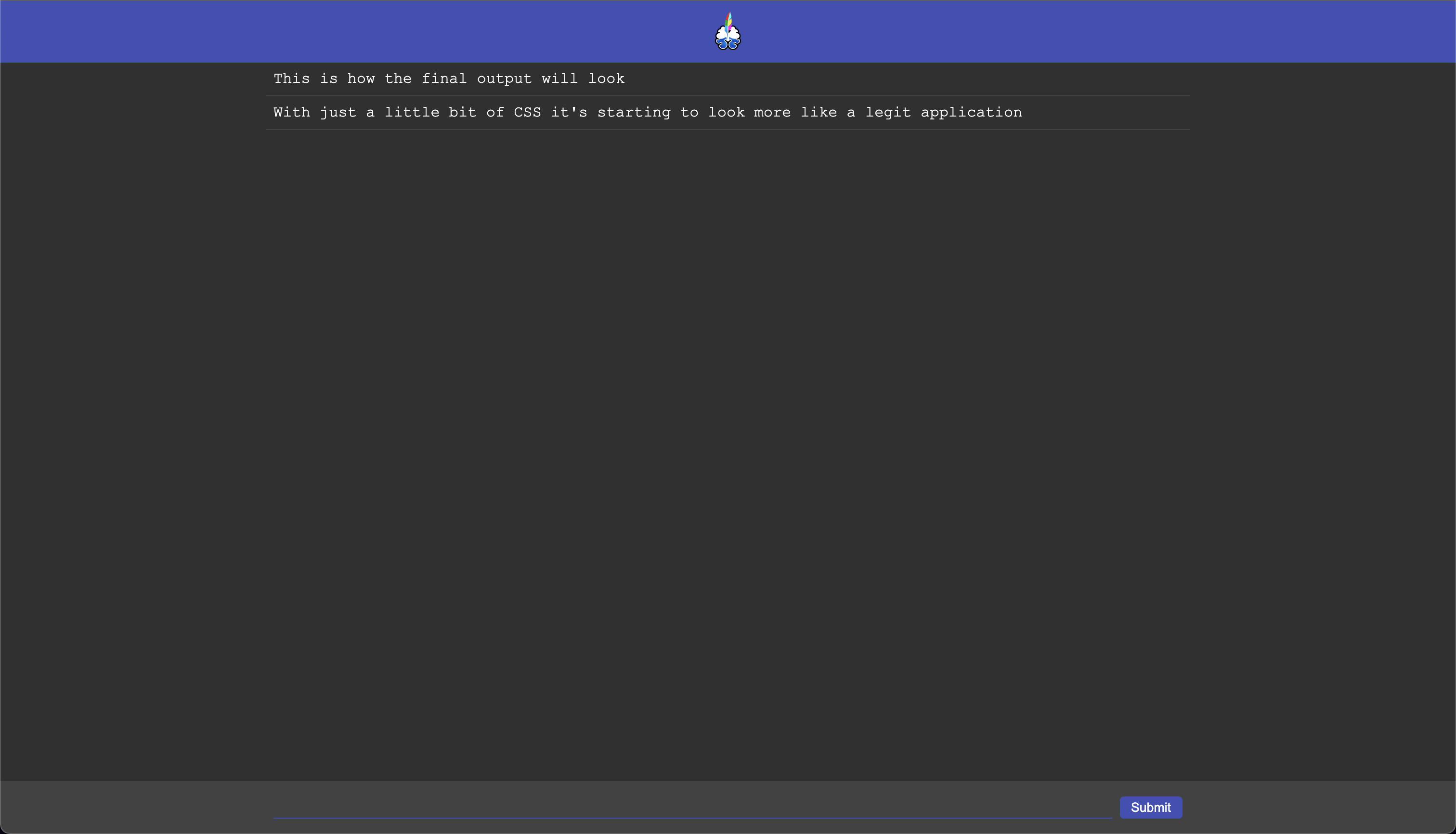
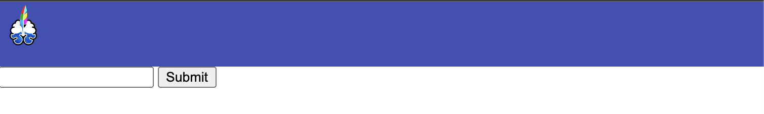
The final webpage will look like this:
Intro to Cascading Style Sheets
This is a topic better covered on places like w3schools and MDN Wed Docs. It’s worth giving those a quick read if you are unfamiliar with CSS. Put very simply, CSS styles allow you to control how elements on a page are displayed. Page layout, colors, fonts, sizing, and many more can be modified using CSS.
There is a lot of depth to CSS. This assignment will focus solely on creating specific designs. I highly recommend learning the different properties available in CSS as you realize you need them - instead of attempting to memorize everything available. You will quickly see which ones are re-used often and spend more time working with those.
Final side note before we begin: I am not a designer nor a CSS master. The final user interface (UI) of this assignment is mostly used to introduce and demonstrate key concepts. In doing so, you will see some of the most common CSS properties and how they work. You are welcome and encouraged to vary the styling from what you see presented here.
Adding a Header
It is common for websites and applications to have a header bar that helps brand the page. Usually it has some kind of color associated with your brand and the name of the product. You are welcome to choose your own app name and color. This project is based on my current project engram, so I will use this name and its primary color #3f51b5.
<html lang="en">

<head>
    <meta charset="UTF-8">
    <title>Notes</title>
    <script>
        window.onload = function () {
            var submitBtn = document.getElementById("submit");
            var inputElement = document.getElementById("input");
            var notesElement = document.getElementById("notes");

            submitBtn.addEventListener("click", function () {
                var div = document.createElement("div");
                div.innerText = inputElement.value;
                notesElement.appendChild(div);

                inputElement.value = "";
            });
        }
    </script>
    <style>
        header {
            background-color: #3f51b5;
            height: 64px;
        }
    </style>
</head>

<body>
    <header></header>
    <input id="input"/>
    <button id="submit">Submit</button>
    <div id="notes"></div>
</body>

</html>
The <style> tag allows you to define the CSS for the current document.
The header part specifies that the text between the { and the } should be applied to all element tags called header.
background-color sets the background color of the element. CSS allows several ways to specify colors. Until you need the others, I recommend sticking with “hexadecimal” colors.
height allows you to specify how many pixels tall the element should be.
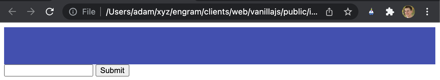
Fixing Default Browser Styles
You should now see that the header isn’t at the top of the page and doesn’t expand fully to the left and right edges. This is due to browsers having a “user agent stylesheet”.
If you open the Developer Tools and select the <body> element you’ll see it has margin: 8px set by default. There are quite a few default styles applied to different HTML elements. In this assignment, we will manually reset any of these as it becomes necessary.
See this summary of the CSS margin property. The margin property is used to create space around elements.
<style>body { margin: 0; }header { background-color: #3f51b5; height: 64px; } </style>
This removes any margins from the body element and then you can see it looks as it should.
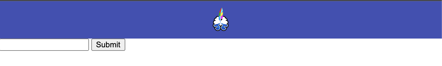
Adding an Image to the Page
Images are one of the fundamental building blocks of a web site. Adding one is as simple as using the <img> tag.
The image we will be adding is a logo in the center of the header. Below is the current engram logo that you can right click and download, or you can use any other image you like.
<header>
    <img src="img/logo.png" width="48px" height="48px" />
</header>
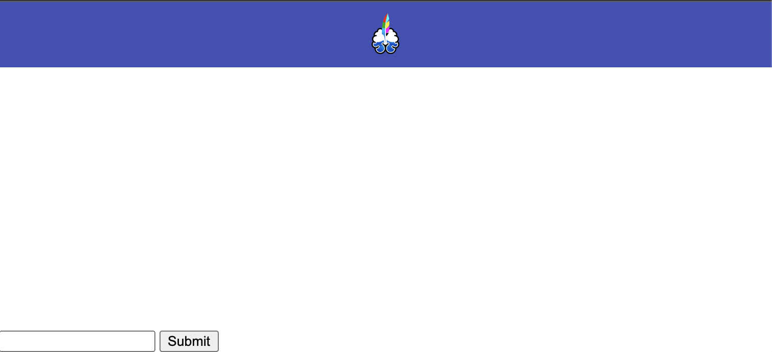
Our logo now shows up inside the header with a height and width of 48px. Unfortunately, it’s postioned incorrectly.
HTML Elements, by default, are positioned from top to bottom and left to right.
In order to center it, we will use the CSS Flexbox Module. This is a very powerful layout tool within CSS. It is worth giving that entire chapter a read to get introduced to some of the different kinds of things flexbox allows you to do.
header {
    background-color: #3f51b5;
    height: 64px;
    display: flex;
    align-items: center;
    justify-content: center;
}
display: flex; tells the element to render with the flex layout. align-items: center; vertically aligns the image inside the header. justify-content: center; horizontally centers the image inside the header element. Try removing and re-adding each of these to see how this affects the rendering of the element.
Centering content horizontally and vertically with CSS is often used as an interview question to determine whether someone has a firm grasp of CSS concepts. Prior to flexbox, it was a bit more difficult, but hopefully you can appreciate how simple the 3 lines of CSS above are.
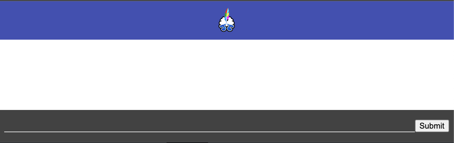
And with that we have successfully completed our header.
Move the Text Input to the Bottom of the Page
Now that we have introduced the display: flex, we will use it again to split the page into three main sections: header, content, and footer. The content will include the list of notes and the footer will have the text input fixed to the bottom of the page (much like the text box seen on most messaging apps).
<style>
    body {
      margin: 0;
    }

    #app {
      display: flex;
      flex-direction: column;
      height: 100%;
    }

    header {
      background-color: #3f51b5;
      height: 64px;
      display: flex;
      align-items: center;
      justify-content: center;
    }

    #content {
      flex-grow: 1;
    }
</style>

<body>
  <div id="app">
    <header>
      <img src="img/logo.png" width="48px" height="48px" />
    </header>
    <div id="content">
      <div id="notes"></div>
    </div>
    <div id="bottom-bar">
      <input id="input" />
      <button id="submit">Submit</button>
    </div>
  </div>
</body>
The # is used to select an element by id in CSS. #app will thus tell the browser to apply the contained styles to the element with id app. flex-direction: column; specifies to render the component in a column (from to bottom) instead of the row default (left to right). height: 100%; makes it fill the entire available space.
The flex-grow: 1; for #content specifies that the #content element should grow to fill the remaining space between the header and the footer.
Styling the Text Input
<style>
    body {
      margin: 0;
    }

    #app {
      display: flex;
      flex-direction: column;
      height: 100%;
    }

    header {
      background-color: #3f51b5;
      height: 64px;
      display: flex;
      align-items: center;
      justify-content: center;
    }

    #content {
      flex-grow: 1;
    }

    #bottom-bar {
      background-color: #424242;
    }

    .input-wrapper {
      display: flex;
      padding: 16px 8px;
    }

    #bottom-bar input {
      flex-grow: 1;
      background-color: transparent;
      border: none;
      border-bottom: 1px white solid;
      color: white;
    }

    #bottom-bar input:focus-visible {
      border-bottom: 1px #3f51b5 solid;
      outline: none;
    }
</style>

<body>
  <div id="app">
    <header>
      <img src="img/logo.png" width="48px" height="48px" />
    </header>
    <div id="content">
      <div id="notes"></div>
    </div>
    <div id="bottom-bar">
      <div class="input-wrapper">
        <input id="input" />
        <button id="submit">Submit</button>
      </div>
    </div>
  </div>
</body>
#bottom-bar simply gets a background-color attached to it.
.input-wrapper demonstrates a common HTML/CSS pattern where you “wrap” some inner elements in an additional div to provide some styling. In this case we add display: flex which will allow us to make the input take up as much horizontal space as possible.
#bottom-bar input is a new type of selector. These styles will only affect input elements that are a child of the element with an id of “bottom-bar”. flex-grow: 1 causes it to grow horinzontally to fill in is .input-wrapper parent. background-color: transparent removes the default white background on the input field, making it blend in more with the background. border: none removes the default border added all around input elements. border-bottom: 1px white solid adds a solid white border to just the bottom of the element with 1px thickness. color: white modifies the text so that the text a user inputs displays as white.
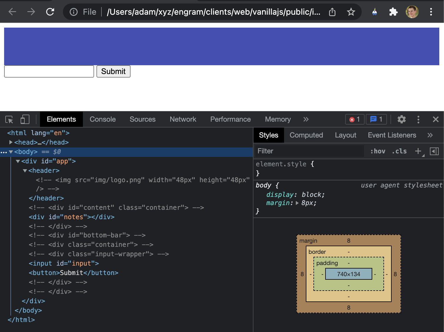
#bottom-bar input:focus-visible introduces one more concept with selectors: psuedo-classes. Psuedo-classes are used to define a special state of an element. In this case, the psuedo-class is “focus-visible”. This is a special state the browser assigns to an element when the user has “focused” on it. By default, this is often a blue border around an element. In this example we use it to change the color of the bottom border. border-bottom: 1px #3f51b5 solid specifies a solid 1px wide bottom border with the hex color #3f51b5. It’s important to note that this style will override the border-bottom that was already set on this element in the previous selector.
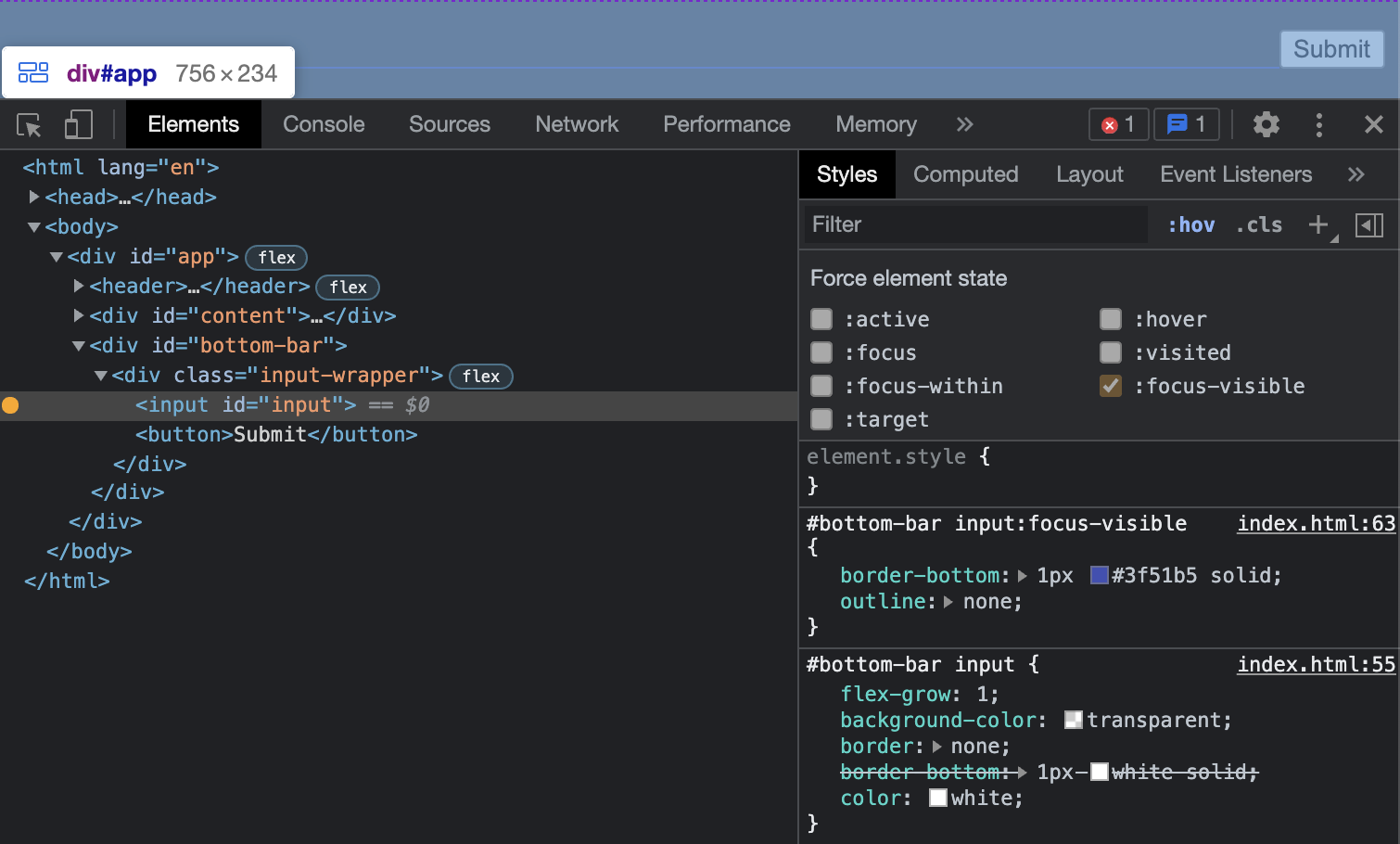
In the image above you can see that the developer tools shows the first border-bottom property stricken through. A single property can only be set once in CSS and if multiple selectors match an element the “most specific” selector will be used. In this case the pseudo-class selector is more specific.
outline: none removes the default blue outline that should around focused elements. And with that, try out the input and see how it changes color when clicking on it and away from it (you can also use tab to focus on it).
Styling the Button
button {
    margin-left: 8px;
    background-color: #3f51b5;
    padding: 4px 12px;
    border-radius: 4px;
    color: white;
    cursor: pointer;
    border: none;
}

button:hover {
    background-color: #3848a2;
}

button:active {
    background-color: #324090;
}
border-radius adds a slight roundedness to the button. cursor: pointer changes the cursor to a hand when hovering over the button. All of the other styles you should have seen already and understand.
button:hover is a new pseudo-class that selects the element when the mouse is hovering over it.
button:active is yet another pseudo-class the selects the element when it is actively by pressed.
The combination of the hover and active gives the user visual feedback that this button is interactive in some way.
Styling the Main Content
<html lang="en">

<head>
  <meta charset="UTF-8">
  <title>Notes</title>
  <script>
    window.onload = function () {
      var submitBtn = document.getElementById("submit");
      var inputElement = document.getElementById("input");
      var notesElement = document.getElementById("notes");

      submitBtn.addEventListener("click", function () {
        var div = document.createElement("div");
        div.setAttribute("class", "note");
        div.innerText = inputElement.value;
        notesElement.appendChild(div);

        inputElement.value = "";
      });
    }
  </script>
  <style>
    body {
      margin: 0;
    }

    #app {
      display: flex;
      flex-direction: column;
      height: 100%;
    }

    header {
      background-color: #3f51b5;
      height: 64px;
      display: flex;
      align-items: center;
      justify-content: center;
    }

    #content {
      flex: 1;
      overflow: auto;
    }

    #bottom-bar {
      background-color: #424242;
    }

    .input-wrapper {
      display: flex;
      padding: 16px 8px;
    }

    #bottom-bar input {
      flex-grow: 1;
      background-color: transparent;
      border: none;
      border-bottom: 1px white solid;
      color: white;
    }

    #bottom-bar input:focus-visible {
      border-bottom: 1px #3f51b5 solid;
      outline: none;
    }

    button {
      margin-left: 8px;
      background-color: #3f51b5;
      padding: 4px 12px;
      border-radius: 4px;
      color: white;
      cursor: pointer;
      border: none;
    }

    button:hover {
      background-color: #3848a2;
    }

    button:active {
      background-color: #324090;
    }

    body {
      background-color: #303030;
      font-family: 'Courier New', Courier, monospace;
      color: white;
    }

    .container {
      width: 100%;
      max-width: 960px;
      margin: 0 auto;
    }

    .note {
      padding: 8px;
      border-bottom: 1px solid #424242;
    }
  </style>
</head>

<body>
  <div id="app">
    <header>
      <img src="img/logo.png" width="48px" height="48px" />
    </header>
    <div id="content">
      <div class="container">
        <div id="notes"></div>
      </div>
    </div>
    <div id="bottom-bar">
      <div class="container">
        <div class="input-wrapper">
          <input id="input" />
          <button id="submit">Submit</button>
        </div>
      </div>
    </div>
  </div>
</body>

</html>
div.setAttribute("class", "note"); is the way to dynamically add a class to the div we created in the previous assignment. This is necessary so we can properly apply styles to these dynamic elements.
For these final style changes, have a read through each new line of code. With what you have learned so far, it should be possible to understand what each one is doing. If one doesn’t make sense try deleting it and refreshing the page to see what happens. If you want to know more about what’s possible for a specific property just google the name of the property plus “CSS” and you should find some decent resources.
Conclusion
This has been my least favorite post so far. CSS is an incredibly broad topic and it’s difficult to know what needs more explanation and what is self-explanatory. More than any other concept so far, learning CSS is best done through experimentation. The goal of this assignment was to give a rough sense of how CSS can be used to achieve a specific design. Try coming up with your own designs and seeing if you can use CSS to make it happen.